Sunday 17 February 2013

Collaboration and UnBox Festival’s Zine Press


Every so often an opportunity comes along which encourages you to think differently about your worldview. In my case, this was an invitation from the organizers of the UnBox Festival 2013 (7-10 February, New Delhi, India) and the British Council to mentor a small invited group of designers, writers and illustrators based in India. Our task was simple: to produce a fanzine during the four-day Festival with a view that it should be off press in time for the participants to take a copy home with them at the end of the event.

Whilst this in and of itself was an intriguing proposition, what I wasn’t so keen to do was merely produce a publication which was a document of the event. Rather, there was a more fundamental question to ask: what might the fanzine format provide as an active space for making? And, in particular, in what ways might the fanzine format facilitate a deeper understanding of the Festival’s remit of exploring ‘action at the intersections’?

So, as we approached this task, we found ourselves asking what ‘Indian design’ might mean. The seven participants soon made me aware that India is a huge country and the diversity of its design perspectives meant that there was not one single identifiable approach or definition to ‘design’. This was reflected in the work, which suggested that diversity was a strength and not a problem. The fanzine became a focus through which our conversations took place. These ranged from the legacy of textile archives and the noticeable absence of a history of design in India to the increasing importance of the role of designers and social design practices.

In a series of accompanying ‘writing for design’ workshops, participants found their own voices, contributing personal 
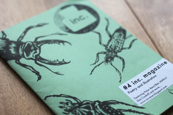
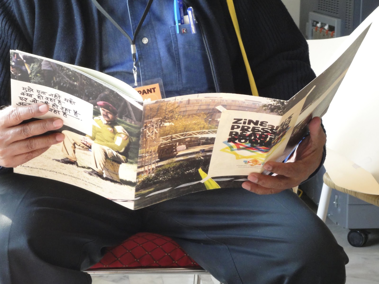
perspectives on what it means to be a designer in India today.  Zine Press contains some of these writings. For example, Rohan Patankar, a final year architecture student from SPA, Delhi, reflected on the importance of scale in urban spaces in his piece on ‘Smallness’. Gauri Sanghi, an art and design practitioner, provides insights into the Festival’s notion of interdisciplinarity and the relationship between individual practice and its relevance to different contexts. Ali Maiorano, currently working in Bangalore, comments on the way in which ‘society is transitioning from the age of communication to a time of action’. She expressed her ideas visually, laser cutting the quote ‘I’m not a dream, I’m real’ into the cover of the UnBox Festival Handbook.

As each member of the team brought back to the Zine Press room photographs, illustrations and tales of overheard conversations gathered from around the Festival grounds, the zine became visually richer as new layers of the experience were added to its pages. Zine Press became more than a document of the Festival: it was a vehicle through which a shared, collaborative experience took place; both amongst the Zine Press team but also with the Festival’s workshop participants. Zine Press became one of many ‘actions at the intersections’ during the four days of UnBox, a way of ‘showing’ through making.  Our zine came off the printing press just in time to hand out copies to participants as the Festival came to a close.

________________
With warm thanks to the Zine Press team: Mayank Mansingh Kaul, Sameeer Kulavor, Ruchita Madhok, Kriti Monga, Deshna Mehta, and Abhijith KR. With special thanks to UnBox Festival organizers: Babitha George, Mohor Ray; and British Council: Aanchal Sodhani, Ellie Smith; and, Pete Collard for starting the conversation over a year ago.

The story continues to unfold here


Now in its third year, the UnBox Festival 2013 emerged out of a desire on the part of organizers to ‘celebrate interdisciplinary thought and work through a series of workshops, performances, exhibitions and talks.’ Held in the grounds of New Delhi’s entertainment facility, Zorba, UnBox adopted a do-it-yourself approach to making.

Thursday 31 January 2013

No Longer Anonymous

Zines are coming in all shapes and sizes these days. Some are analogue and some are digital, and some are both. And usually, they are ephemeral. As digital technologies become increasingly ubiquitous, it isn't surprising that that the zine format is likely to morph into something new. Possibly exciting - most certainly different!

It is with this in mind, that I recently got in touch with Karolis Kosas - a Lithuania-born designer, whose   master's thesis in visual communication (in the US), began to explore ideas concerning 'autonomous systems' specifically in relationship to DIY publishing. What emerged out of his research was Anonymous Press - an online random generator taking themed information off of the Internet and producing the more familiar fanzine form virtually. Α–Π not only about the design process, but also about the removal of the designer from the process itself. And, here's the really good bit - you can download each random 'designer-less' creation which has been deposited in an online archive. Karolis' work questions the role of the physical in this new world of the digital whilst at the same time getting us to think differently about zines. With zine titles such as: Fake Los Angeles, SKEUMORPHISM, Ex-Girlfriend and Whitewash...what's not to like?

An interview with Karolis Kosas:

1. Tell me a little something about yourself and what brought you to developing 'Anonymous-Press'? 
I was born and raised in Lithuania. Few years ago I came to USA to study for master's degree in visual communication. Pretty much all life I was somehow involved in graphic design. The project started as a part of my thesis investigation on autonomous systems. In the very beginning I was interested to see, how design process would change, if the expert (the designer) were to be replaced by the crowd.

2. How do you square the idea of 'anonymous' in relationship to a desire fanzine producers often intend in the content creation of their zines; e.g. to share something about their personal interests and passions with others?  Do you still feel that this still achieved with A-N;  why or why not?
I believe that Anonymous-Press is fundamentally different to the traditional forms of DIY publishing. The subjective factor of the user (or the publisher) is framed in the 40 characters of  the input box. A user no control over the form and does not take any part in the process of production. The publisher requests and is delivered an end result in a matter of seconds, whereas in traditional publishing the process takes time and consideration. Still, I think that Α–Π is a relevant representation of how culture is perceived in the contemporary society. I feel that the Input Box has become a main medium between us and our desires. 

3. Some critics predict a future where we will increasingly be interacting with objects in new and different ways. Where do you see the book/fanzine as 'physical object' in this scenario?  What might this mean for future readers, and importantly, the role of writers and designers in this?
I don't think that such future requires that we throw out all our physical stuff. I really like how Kenneth Goldsmith puts it: 'The twenty-first century is invisible. So we need to live with our books and our old furniture.'

 
4. Whilst I appreciate you are using A-N as an experimental platform, the implications are interesting enough to consider for the future role of the digital archive. Who are the archivists now? And, what does this mean for documenting popular culture in the future? Any thoughts?
The search enquiry, still a relatively new phenomenon, has become an almost ubiquitous mode of getting to what we need. Anonymous Press might become a valuable source of anthropological data, as it portrays both the enquiry and the feedback, a slice of the Internet representing our interest at a particular moment. For me, even more exciting is to observe this archive emerge independently without a plan or a coordinator of any kind. 


Saturday 26 January 2013

From Zines to Design and Self-publishing

Admittedly it has been a while since my last interview and entry on this blog. I've been working on a few new things around self-publishing, digital technologies and indie magazines. Fanzines are still very much on my radar, but I've noticed a trend toward the take-up of this unique form by the graphic design community. Zines are morphing into new kinds of communication, with different audiences and intentions. I'm interested in exploring what this means for the role of fanzines. So, with the next few entries at least, I am shifting into new territory and attempting to critically engage with the zine as a new design form.

Monday 9 April 2012

Interview 35


Amber Tan and Andy Johnson are editors of the paper-based
Über zine and of the creative blog Purple Revolver. Here they tell us a little about their obsessions and 1990s popular culture.

Please tell us a little about yourselves, your backgrounds and where you are currently based.

Über zine editors Amber Tan and Andy Johnson are both national newspaper journalists working out of Liverpool and started the Purple Revolver creative blog which features on Google News. They have a team of 30 writers, photographers and artists across the UK, who work on the site and also Über - now into its seventh issue.

Amber, 31, is the eldest daughter of six and chased her dreams of becoming a journalist as a teenager, breaking into the world of reviews in Bristol, the home of trip-hop in 2000.

Andy, 32, is a basketball junkie. He believes what you do as a child determines what you do as an adult. At the age of 10 Andy produced a home made comic called The Laughter Times and now wants to do it for a living.

Über was launched in 2010 - how did the zine come to be? Why keep to a limited edition print run of 800? Who do you think your readers are and what do you hope to achieve by its publication?

Über zine launched in April 2010. We had it in mind as a prototype for a series of city guides and a way of collecting articles about Liverpool, Bristol and their creative scenes and it has evolved and moved in a different direction from there.

We publish it as a free zine in a short run of 800 as eight is our lucky number and we like the idea of it being limited edition, appearing on the streets for a short space of time and once it's gone, it's gone making it sought-after with our regular readers. Also, as all zine makers know printing is expensive.

Our readers are a broad cross section of people, everyone from youngsters to older artists have written to us to say they enjoy it and it covers a wide cultural spectrum. We have also picked up some mail-order readers from around the country, which is encouraging. We started
Über as a means to give us freedom of expression away from the usual tabloid fodder we've had to cover in our working life as journalists.

Without getting ahead of ourselves we'd like to see the zine grow in circulation and be able to support itself as a fully-fledged underground national publication celebrating offbeat culture. We've been able to pay the best artists and contributors and would like to develop that and form our own creative community.

We would also like to be able to support spin off publications under the Purple Revolver and
Über banner with other artists and writers. Such as the Digital Jesus - lost superhero comic creation from the middle of the past two issues, which has taken on a life of its own.

You published a '1993 Future Throwback' issue reflecting back on various aspects of popular culture during the time (e.g. thrift store chic, films and Grunge), but have also said that the zine aesthetic you have adopted is from the 1990s. What is it about the 1990s you find so appealing? And, how does this attitude carry over into the visual language of your fanzine?

We both came of age in the 90s and it seemed an especially exciting time to be a teenager. The DIY ethic loomed large with illegal raves popping up and a lot of artists were doing things for themselves. This creative vibe stuck with us and when we started planning our zine we were conscious that this 90s spirit should inform its aesthetic.

The early 90s were also the end of an innocent pre-internet era, where you had to put more effort into discovering what excited your senses, whether it was music, fashion, love or friendship.

The American influence on British fashion and culture was huge in the early 90s and teenagers had to work hard to hunt down limited edition music imports, order US fashion via mail order and experiment with a few different scenes before discovering which cultural tribe they belonged to.

Compared with today's more homogenised culture, with many genres being 'mashed up' to try and create something new and the world of social networks and the Internet means ideas, music and fashion releases move at lightning speed and are now all available 24 hours a day in your pocket.

We're both obsessed with America and have done extensive travelling over there, as teenagers and together, and we predicted the big 90s cultural comeback and wanted to be able to reference this in the zine.

But the idea has evolved and the upcoming issues of
Über will focus on this resurgence and document it using an 18-year business cycle theory that we've referenced and applied to popular culture.

We were looking into economic cycle theories for a feature and spotted the Homer-Hoyt 18-year economic cycle theory, which follows that house prices can't rise indefinitely, at some point they become unaffordable in relation to the average man's salary in the face of wild property speculation and so follows a period of boom and bust.

We looked back to the last recession in 1992, drawing comparisons and we believe it can also be applied to the worlds of fashion and music and other creative endeavours, which are now adopting a similar DIY ethic to overcome a lack of money and artistic funding.

Also in terms of the visual language of the zine, we're big fans of the cut and paste style, which gives us an opportunity to explore our own artistic ambition, the physical texture and depth you can get from cut and paste on the page is like nothing else. Being able to stick a packet of Rizlas and adding your own backgrounds before scanning it gives an extra element to interviews, especially a spread we did with Howard Marks.

Unfortunately due to the time-consuming nature of physical cut-and-paste we've started recruiting graphic designers to layout some of our articles and they have some amazing tools in their arsenal, but the end result does not feel the same. With cut and paste each hand-crafted page is unique like a thumbprint.

Do you feel there is a tension between what you do as a press agency (Purple Revolver) and the underground, Indy, DIY ethos of fanzines?

We have a more commercial outlook for what we do as Purple Revolver and even more so for our work as tabloid journalists.

But
Über was born in many ways as a rebellion against what we had to do for the mainstream media. Purple Revolver began as a way of being able to write about what we wanted - music and film. Über takes it a stage further with its 'Take No Prisoners' attitude and we've found it to be one of our most well received projects.

Some people might sneer at the fact that we spent time writing for national newspapers like
The Sun, The Daily Star and glossy women's magazines, but we've also spent time writing for publications like The Times and The Telegraph. This sharpened our writing style (tabloid writers have half the amount of words at their disposal to tell the story compared to the verbose nature of The Guardian). Also our business sense as to what would appeal to readers and enable us to produce an independent publication on a tight budget.

We've also been able to pass on what we've learned to writers and other creatives who've worked with us on the zine.

What fanzines do you recommend that we should be reading?

We always pick fanzines up when we see them on our travels and are big fans of the zine libraries in Shop, Bristol and the Salford Zine Library. Smoo Comics in Bristol is a great one for the artwork.

We're also trying to track down some zines to add to our collection such as
Everyone Needs A Hobby about Tim Burton (from 1994) - because we're looking to focus on Ed Wood for our 1994 Future Throwback issue and Passing Wind about Peter Cook.

Every
Über zine has a theme - The Money Issue, The DIY Issue, Future Throwback Issue, Christmas and New York and the latest 1993 Future Throwback issue and if anyone wants to check them out they can find them on our website.

Thank you.

Interview 34


Dom Raban produced political/music zines Frayed Edges and later, between 1980-85 Proper Gander, whilst living in Sheffield. These days he spends his time as Managing Director at the design and communications agency Corporation Pop based in Manchester, UK.


Please tell us something about your fanzines and how they came to be.


I started my first fanzine, Frayed Edges, in Southampton in early 1979. At the time I was a young activist in the Labour Party Young Socialists (as well as being a punk). The fanzine was initially put together by a group of us at the LPYS (on the fringes of that group was John Denham - now an MP and former cabinet minister) and reflected our political as well as musical interests. As I moved away from the Labour Party towards a more anarchic political doctrine so did the fanzine - I think the Labour Party stalwarts finally took umbridge when I took to the streets of Southampton with a spray can to publicise the mag. I ended up producing five issues before moving to Sheffield to start a Zoology degree.

I didn't take my degree very seriously (dropped out at the end of the 2nd year) but in my first term I started another fanzine called Proper Gander with a group of friends. Proper Gander was similar to Frayed Edges in that it mixed music and politics (though this time without the Party connections). It was an exciting time to be in Sheffield - with Cabaret Voltaire and the Human League hitting the mainstream and new bands like Pulp, Chakk, ABC and many others emerging from the scene. Politically too there was lots going on - Sheffield was 'the Socialist Republic of South Yorkshire' and the miner's strike was on our doorstep. Proper Gander documented all this - and many of the main players in the music scene were regular contributors. Between 1980 and 1985 we produced twenty issues. In 1983 or 4 we officially became a Workers Cooperative with help from Sheffield City Council's Cooperative development team - though this 'official' status was short-lived because we were too stoned to keep up with the bureaucratic paperwork. From about 83/84 we had an office in the newly opened Leadmill, which at the time was one of the 'must play' venues on the live music circuit.

The first few issues were printed by various 'radical' printing outfits around at the time - including Rochdale Alternative Press and a similar print shop in Leeds whose name I have forgotten. But - following the true DIY ethic - I learnt to operate an offset-litho press at a community print facility in Sheffield and printed the remaining issues myself.

By 2005 (or thereabouts) I stopped producing the fanzine but my experience of 6+ years with Cow Gum, typewriters and particularly print fostered a love for design and production and so in 1988 I set up a design company on Thatcher's Enterprise Allowance Scheme.


Clearly politics and music have played a key part of your passion for doing a fanzine. I read in an excerpt from Vague (No.6) that you were 'scooped' in getting the interview with Devo. I don't know if you remember this, but it is interesting to note the competitive use of language.

'June 9 Devo at Southampton Town Hall. Chris Johnson was pictured posing in a Devo hat as he scooped the Southampton fanzine Frayed Edges for this interview with Devo's Jerry Casale.'

Was this reflective of a competitive spirit between producers of music fanzines to get the band interviews during this period?

We weren't so much competitive as territorial. I don't remember the Devo incident but I do remember Vague. At the time Southampton was a one fanzine town and we were it. Vague hailed from Salisbury - a cathedral town whose biggest claim to fame was as the home of Edward Heath - world's apart from the multicultural port of Southampton. When we travelled to other towns and cities to see and interview bands there was a definite and delicious sense of trespass – and I think there's an element of this in the Vague comment.

You've produced zines in cities which would be considered 'provincial' by some, but foster strong regional perspectives. What is it about your zines (either through content or graphic language) where you feel this is reflected?

Frayed Edges definitely reflected a small town scene and a regional perspective. Punk took two years to travel down the M3 to our coastal outpost – but when it arrived we greeted it with the same fervour it had received in the early days on the Kings Road. By this time the London scene was on its knees and had become little more than a photo opportunity for Japanese tourists. Down in Southampton we were re-inventing the DIY ethic and finding our own self-expression (I earned the nickname 'why pay London prices' from one wag because I made my own clothes and screenprinted T-shirts with artwork ripped from my favourite album covers of the day).

But Sheffield and Proper Gander was entirely different. You could justifiably be lynched for calling the Sheffield of 1980 provincial or regional. We were the Socialist Republic of South Yorkshire. We had dirt cheap public transport, workers coops and David Blunkett leading the revolution! We didn't take any notice of the dandy pirates and indian squaws that characterised the London scene of the early 80s. We had industrial funk and took pride in the fact that the best music of the day originated from Steel City. Cabaret Voltaire, The Human League and later Chakk, Hula and Heaven 17 as well as a host of local bands were defining a new music that influenced London - not the other way round.

Sheffield did for the early 80s UK music scene what Detroit and Chicago did for the music of the latter part of the decade. The politics of South Yorkshire also defined the era. Whilst the south of England was waving bunting for our boys in the South Atlantic we had troops on the streets fighting pitched battles with the miners. There was a genuine sense of revolutionary fervour - albeit clouded by a fug of ganja and a plentiful supply of magic mushrooms just a 4p bus ride away. Proper Gander documented most of this - both the politics and the music - and our fluid editorial team often included musicians from the bands which were shaping the city's music scene.

What other zines from the 1970s/1980s were considered to be key in establishing points of views that influence music and politics of the time? Or, at the very zines which you feel would give us some sort of historical insights into the UK scene.

Sadly I've lost the copies of the fanzines I used to collect at the time and my memory is hazy when it comes to recalling all the movers and shakers of the day but one that I'll always remember from my punk days was Kill Your Pet Puppy. I loved not only its outrageous and provocative title but also the graphic style which, with its brash colours and bold typography embodied the zeitgeist of the time. Later on when I was in Sheffield it was City Fun over in Manchester which provided the model for us to aspire to.


Friday 16 March 2012

Interview 33


inc. magazine is a poetry and illustration fanzine edited and collated by Will
Coldwell (WC) and Anya Pearson (AP). Here they give us insights into what the role of music has been in the zine's creation and what it means to be 'poemed'.

Please tell us a little something about your backgrounds, how you came to be affiliated with Soul Rub Collective and how your zine inc. magazine came about.

WC - Soul Rub was started a few years ago by Greg Sanders, a friend of mine I've known since school who is a musician and formed it to help increase collaborations and events with various other musicians and groups that we know. Much to my disappointment, my musical ability was never quite up to the same level as these guys, but I've always loved zines and writing, so I thought I would contribute to the collective in a way that I could do best, rather than hitting a triangle in the corner of the stage... It made a lot of sense since a lot of the musicians in Soul Rub write poetry, perform spoken word, and rap, and every issue so far has had contributions from them. Our launch parties have also featured performances from bands such as Fur and ourselves and other poets who have been in inc. often perform at Word Is Born, a monthly night organised by Soul Rub. I think Greg put in £20 to help print the first issue (which was actually about 50% of the costs...but you know how these things are!)

AP - As well as being big fans of the Soul Rub guys, I've been writing songs and playing in bands for years and I started to write poetry as a natural progression from that. I think we started the zine during the same period I wasn't in a band for a while, so I threw my energy into making that happen instead. Now I'm juggling both, which is even better, though maybe a bit time consuming! It also makes it hard to decide whether a piece of writing should be a song lyric or poem.

inc. magazine brings together 'spoken word', slam poets, etc. alongside emerging UK-based illustrators. In what way do you see this fanzine as a form of collaboration? How important is the resulting visual aesthetic?

WC - Issue 3 was the issue where we really nailed the concept for what we wanted inc. to be in terms of visual aesthetic, and in terms of how we wanted it to be a form of collaboration. We had enough money to pay for beautiful risograph printing and we teamed up with Illustrators Elbow collective who did all the images for the issue. Half the issue was poems that had been illustration and the second half was illustrations that had been 'poemed'. We decided that we wanted inc. to challenge the traditional way of presenting poetry where the illustrators just respond to it in quite a passive way, and bring them in on the game. It worked really well, and we decided from then on that each new issue should have another dimension to it, controlling the way the poets and illustrators engage. This is great fun for us - because we get to come up with the rules!

AP - Issue number 4 was a chain, where we just sent either the poet or illustrator a piece and they had to respond to it blindly. It makes the whole construction of the issue a collaboration because in some ways everyone who contributes is made to engage with the idea of it, rather than it just being a passive collection of work. Nobody knew how that one was going to turn out, and some pretty unlikely themes grew out of it, including skinny dipping and murder. You can just about follow the connection between those two, I guess....

WC - Yeah and the collaboration extends into our launch parties where the poets, many of whom are performance poets get a chance to do their thing, there's live illustration and most of all its a chance for everyone involved to meet each other. It's quite sweet seeing the poets and illustrators go and find the person who had interpreted their work and then having a drink with them. Heartwarming stuff!


How might you differentiate inc. magazine (if you consider it to be a fanzine) from what we would normally categorize in poetry and literary publishing as 'little magazines'?

WC - Well I suppose we blur the line between a traditional fanzine and an art book or poetry pamphlet. I would like to think of it as a zine because it started in response to a scene and what was happening around us at the time, which was poetry and spoken word in particular becoming really popular and people we knew putting on events mixing hip hop/spoken word and music all together. A lot of zines are made when people get together and cut and paste stuff onto paper and I like to think inc. is a bit like that because everyone is in on the idea from the moment we start the issue. More traditional poetry or literary magazine seem to have a more formal approach to their contributors and are about showcasing what they feel is the 'best' stuff around. We see each inc. as a project - a lot of the content is 100% original to that issue too. If we wanted to just publish some good poetry then I guess we could but for us its very much about the production of the issue, and this is something I've always associated with zinemaking. I suppose because we try to invest a lot of time into the design it could be seen as more of an art book, but I don't worry too much about defining it. It seems to work for everyone involved!

AP - Some bookshops were a little iffy stocking us when we first started out, but I think inc. looks more like a 'little magazine' nowadays - we look a lot more crisp and well-made from the outside even if we're zine-y within. I think we were called a 'comp-zine' once by a reviewer. You won't catch us in WHSmith anytime soon though.

What is the role of your blog/Twitter and how does it work in relationship to the printed zine?

AP - Our blog is a nice way to showcase poets that we like in between printing issues, but we also host a lot of other material on there. Our friend and my bandmate Nick Taylor makes fantastic podcasts of our launch events which have recordings of poems and interviews. They're really atmospheric - there's a lot of whooping and cheering in between sets. We also host on issuu past issues because we only make small runs and its nice to let people see it after we've sold them all. I've got mixed feelings about Twitter but I have to admit it's just amazing in terms of reaching specific networks and getting the word out there. Since we set up our account we've managed to gain loads more poets and illustrators and its great for promoting our launch parties and even encouraging people part with their cash and buy a copy!

Finally, any other zines you might recommend for us to read, and please tell us why.

AP - We work with Nick Murray and his Annexe magazine quite a lot, which are great. Recently he was part of an exhibition with Ladies of the Press, where he typed up poems and prose onto long strips of paper and wound them in old cassette tapes, so you read them as they run between the spools, which I submitted a short piece too. There's lots of interesting material on his website, including a series called 'Two Poems' where people perform one of their own pieces, and one piece that's inspired them. We're also plotting and planning an installation for our next launch party together. He calls Annexe 'a love letter to the written word' which is pretty apt I think.

WC - Conceptually, I fell in love with The Rashomon Effect the moment I heard about it, when I was living in Amsterdam. Its a literary magazine, which features flash fiction, poems and artwork too. But you can't buy it anywhere. Instead they hide it round bookshops in Amsterdam and then just post a list of addresses for you to find it. I think some wound up on the shelves of adult entertainment stores in between the porn mags...I remember spending an afternoon looking but never managed to get a copy, but luckily you can print them from their website for free! I was really happy when they put a short story I wrote in their last issue, and Grant Walker who is part of them has contributed to inc. I think they come pretty slow off the press though...but hopefully they'll keep them coming.


Friday 9 March 2012

Interview 32


Zine Columbia (2003 - present) is a collaboration between the design and illustration students in the Art + Design Department and students in the Fiction Writing Department at Columbia College Chicago. Design Director and Faculty member Craig Jobson (CJ) and Columbia Senior Graphic Design students Andre LeJune (AL), Susie Capithorne (SC) tell us more about the ongoing project and what the collaboration means to them.


Please tell us a little something about the history and background to Zine Columbia, how and why it came into being.


CJ: Most of the students currently working on a recent issue of Zine Columbia were still in middle school when the zine first began publishing. Then it was a little closer to a “traditional zine” in that the students provided their own copy around a given theme, provided design and art work to support the text, and finally pooled their own finances to get a collection of visual essays published.

SC: Zine Columbia is a student publication whose concept and execution is driven by Craig Jobson. The purpose of the Zine is for senior-level students in either graphic design, illustration, or fiction writing to take their finely tuned art skills and beat them into a pulp and then barf them back onto the page in an energetic, exhaustively backwards way, which usually toes the line between reckless abandon and creative genius. It’s just an exercise, really...

AL: 1. I don’t actually know the history of Zine Columbia, but I gather that it began because the faculty recognized that Zines are one of the last remaining bastions of print publication, and that students should be introduced to and instructed about creating work for a Zine as part of a broad view of publication design. Additionally,I believe it started because of Craig Jobson’s tremendous dedication to being sure his students have access to as many real world experiences in printing and publishing as they can get.

Each issue produced is presented as dual themes (the publication is divided into two halves) such as 'Carnie Milk/Dank Fever'; 'Pickle Stitch/Butter Bound'. Could you say something about the rationale behind this duality and about the process students undertake in naming.

CJ: Two different sections (18 students each) of my Publication Design class meet on different days at different times. Each member of each section is assigned a cover, a TOC and a two page feature. The cover and the TOC are separate design competitions where lone winners are selected by majority vote in each class. Before a cover can be designed each class does a word matrix exercise that can generate over 3,000 names in less than two hours. Each class then votes on a winning name for the semester project. Incidentally, though each feature has it’s own art director, the class must vote the feature into the semester publication. Though each half of the issue is named there is no theme other than the whole publication being “An Anthology of Graphic short Stories.”

SC: Naming the magazine is an illogical process but I think people get the most emotionally invested in it. I actually saw a girl tear up with rage because we weren’t going to call the issue “coconut-flavored fireworks”.

AL: I believe the duality comes down to providing both sections of the class with an opportunity to experience the process of naming a publication of business, and to discuss the practical legal considerations that need to exist side by side with the creative considerations. I think the layout also augments the feeling one has when reading the zine of not knowing quite how or where to begin to tackle the content of “dark human experience” each piece of fiction portrays.

In terms of the content, two terms are used to introduce the style of stories which are contained within the publication. Could you explain what is meant by ‘flash fiction’ and ‘visual stories’ and why Zine Columbia takes this as a starting point.

CJ: In 2009 we moved away from art directors providing the text and we began collaborating with the Fiction Writing Department’s Jotham Burello and his Fiction Writer’s and Publishing class who enthusiastically provided us with “Flash fiction.” This is where our writers pump as much observation and charged language into the 350 - 400 word stories as is humanly possible. “ Visual stories” are what we end up with after the art directors have designed the stories using image making techniques and experimental typography.

SC: Each 2-page spread is like one dream sequence. The‘visual stories’ are the picture parts of the dream; the ‘flash fiction’ is the verbal part, which represent your semi-logical thoughts during the dream. I’m a designer not a writer, so I’d guess from reading Zine Columbia that ‘flash fiction’ refers to stories about drugs, sex, violence, or psychological manipulation... Basically short stories about any of the scary things that you wish you were cool enough to try out in real life..?

AL:The fiction writing students can probably speak to this point better
than I.


As students contributing to this zine, what have you gained from the collaboration and from what you have learned how might you apply this to your own working practices? As a teaching tool, how have the tutors defined this exercise in publishing?

CJ: At the beginning of each semester I share an observation with members of the Publication Design class and who, by the way, will all be graduating at the end of the term or the following term. I tell them that by this time in their academic career there is not a person among them who could not design a beautiful two-page feature for any magazine published in the US. But can any of them design a readable page that establishes new boundaries with type, image and the reader. Can they design “outside the tyranny of the page parameters” ? That’s the challenge of Zine Columbia. Can you break the rules and still be cogent?

SC: I had never before had the chance to work exclusively with a writer and an illustrator on a piece that totally felt like our own. It was a rush to “hire” the illustrator for my 2-page spread, and then be forced to schedule meetings with her every week, and then be solely responsible for representing what we had done together. It pushed me into the risks of professional collaboration, without a stressful monetary component. We only had to deal with signature permission forms.

AL: This publication is an excellent opportunity to work with illustrators and photographers, and learn to collaborate with an outside person and their time constraints to meet your own deadlines. I think it teaches students about communication and scheduling when working collaboratively, and also about the give and take of individuals’ creative visions coming together.

It could be argued that Zine Columbia has taken the format of what we might consider to be a magazine with it glossy pages, DTP, and use of more sophisticated printing production processes rather than a DIY fanzine. In what ways do you feel the publication remains true to it original fanzine ethos? Or, in what ways might you be redefining what a fanzine could be?

CJ: What we do is “graphic design on steroids. “ Students are invited to break the rules with considerable skill in order to create content that is readable, meaningful and graphically imaginative.

SC: Good point. I wonder if we shouldn’t start binding our Zine Columbia issues ourselves, in class. That might be more true to form with the whole ‘zine’ history, right? Why not? I’m going to suggest that to Craig.

AL: Glossy paper does not a magazine make. When introduced to the zine, the designers are asked to take all the rules they’ve learned about traditional typography and break them (with purpose). The writers are creating very non-traditional frequently very dark works of fiction, and the designers and illustrators are asked to make the feel of each story shine through in imagery and non traditional typography and design. From start to finish, all aspects of the zine are utilized to speak to that dark, damaged, and odd side of the human experience presented to the writers in the initial challenge.

And finally, what can we expect from the next issue?

CJ: Better conceptual illustration, more meaningful experimental typography. Covers that should grab you by the seat of your pants and not let go.

SC: This Spring 2012, I am thrilled to have the opportunity to be part of another issue of Zine Columbia. [ Students move pretty fast through Columbia, so it’s kind of rare that we get involved with the publication twice. ] I can tell already that this issue is going to have a totally different vibe that the Winter issue. This Spring’s crew is on a whole other wavelength when compared to the artists of Dank Fever / Carnie Milk. The new zinesters are interested in playing off of historical genres and twisting them into new contexts, whereas previous artists, it seems, were focused on original works of pure fantasy. The Spring 2012 Zine is called Elastic Lumberjack / . I think you should expect to see more emphasis on typographic treatments and more distortions of existing styles. This group doesn’t think twice about mashing up stuff they find lying around and then just using it in their art! ... Is this a product of the social media age, or what? [ Did Gen X just graduate and now it’s all coming from Gen Y?] In any case, I’m curious to see whether design industry people will also notice this shift. [P.S.. I’m sure you won’t recognize actual/specific genres or references. Jobson is super strict about copyrights.]

AL: I think you can expect great design. No layout makes the cut that an extremely competitive and professional group of design students don’t think is A+ work.


Cover Designs: Nazomi Yamawaki (Fuzzy Pucker/Issue 12)/ Elizabeth Puetz (Reckless Cowboy/Issue 12); Shannon Neuner (Dank Fever/Issue 13)/ Vince Desantiago (Carnie Milk/ Issue 13)